Conceptual design and website layout development for the York Region Children's Aid Society website, completed as part of the 2025 RGD Project-Based Mentorship Program. A team project led by Stephanie Strawbridge, alongside team members Annie Jong and Isabella Yang, the primary goal was to modernize the site, improve user navigation, and establish a stronger visual identity.
Background:
As part of the 2025 RGD Project-Based Mentorship Program, the team was tasked with redesigning the existing York Region Children's Aid Society website to align with modern web standards. This included the development of a new logo and high-fidelity design elements. The 12-week project covered all phases from initial concept to final delivery, with each stage thoroughly documented.
The two priorities of the redesign were:
Redesigning the website to improve layout and overall user experience
Creating a new logo tailored to appeal to the target audience, primarily children
With these two priorities as a factor in the redesign, prototypes and site maps were developed to define the functionality, key elements, and overall layout of the redesigned website.
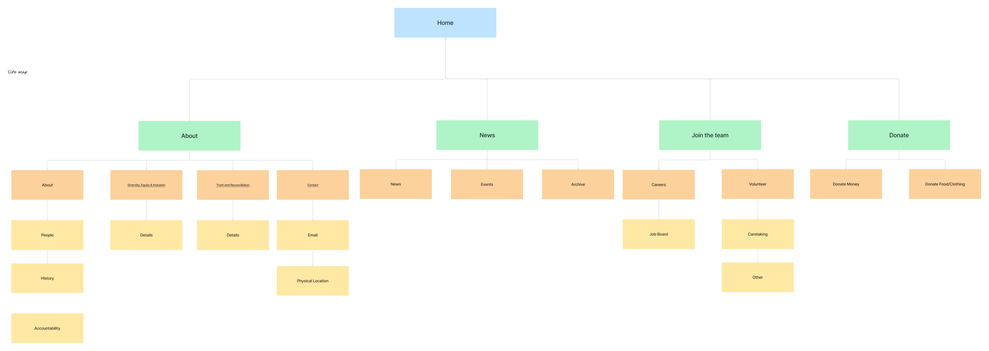
The site map, showcasing the structure of the redesigned website. The menu would be condensed into 4 headings, with each of those having their own drop down menus with subjects that were related to each other.
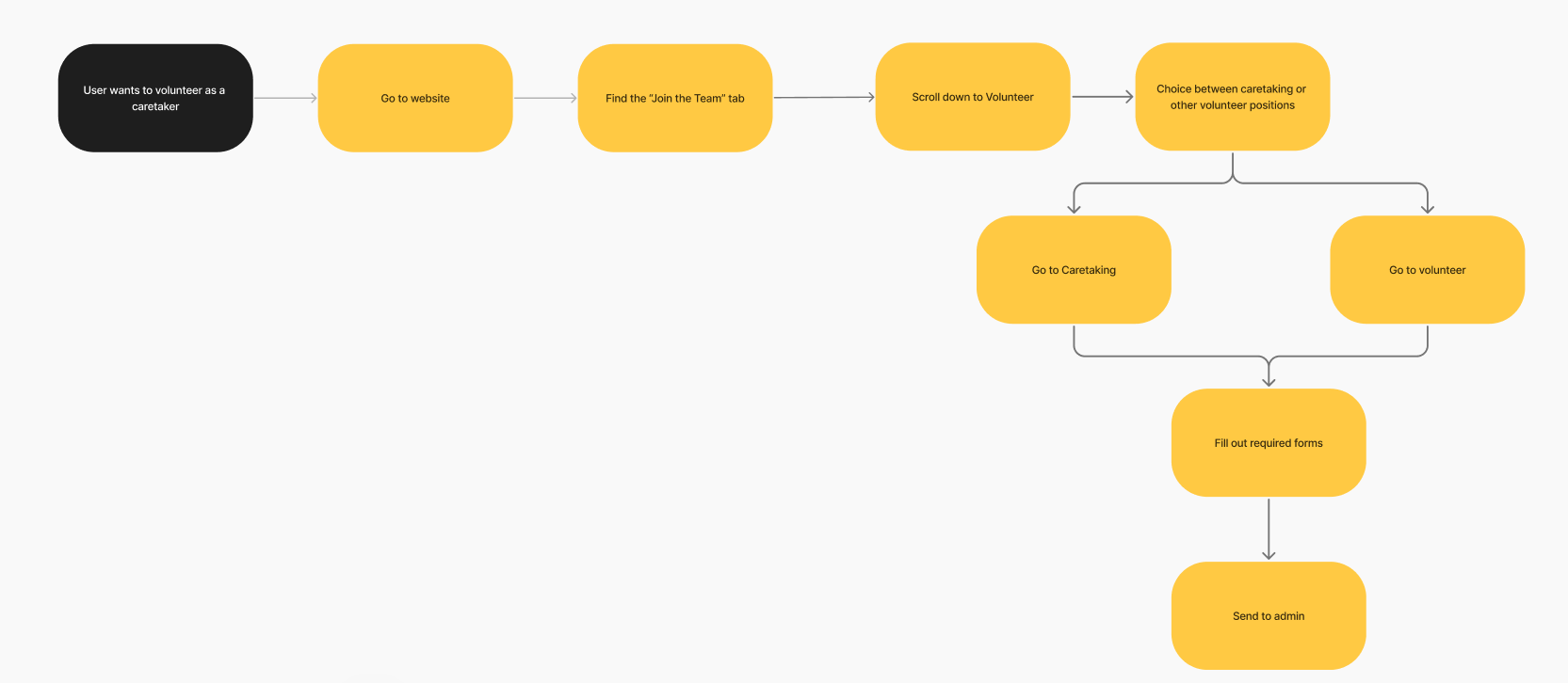
One of the various user journeys, this one showcasing the steps when someone visiting the site would take in order to join the organization.
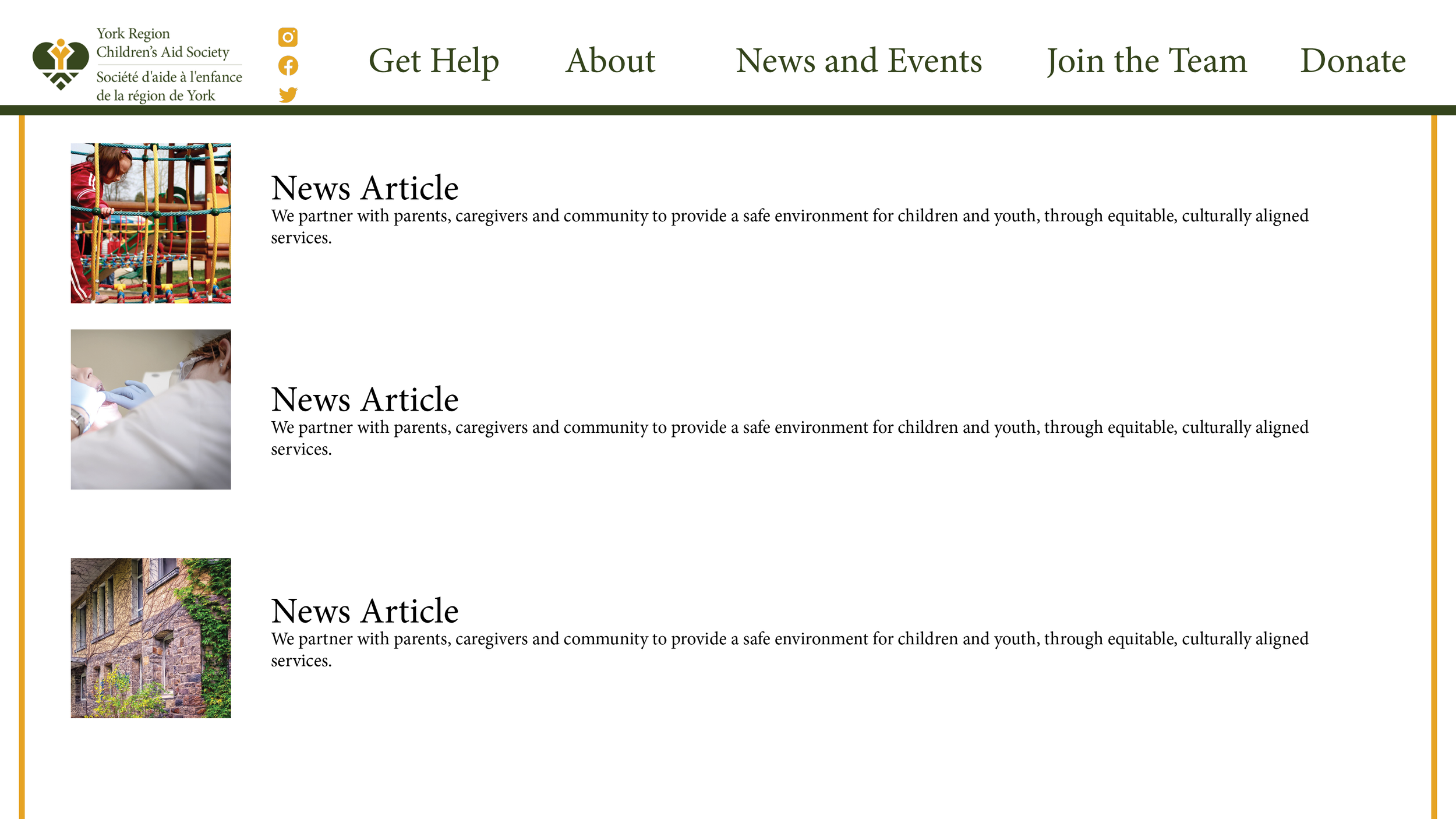
Initial website redesign concepts included enhancements such as a restructured main menu toolbar for improved navigation and adjustments to typography and layout to enhance overall legibility.
Conceptual logo redesigns focused on creating a more child-friendly aesthetic, aimed at better resonating with younger audiences. Several concepts explored visual elements such as parental figures and hand-drawn scribbles to evoke the look and feel of children's drawings.
Prototyping of various design concepts to implement on the final copy of the website, created and edited on Figma. These included elements such as a grid pattern and images alongside text blocks along with an experimental design to render the website’s appearance as a school notebook, as seen with the placement of sticky notes and pencils on the website.
Following the finalization of the logo design, an official mockup was developed for presentation to the Case Study team. Additionally, a style sheet was prepared to outline the approved fonts and colour palette for the website.
Brand Guidelines: Clear instructions were provided on the logo and different colour variations, ensuring it remained visible and impactful in various applications.
Typography: The chosen typography was selected to complement the new identity of the York Region Children’s Aid Society while maintaining readability.
Colour Palette: Specific colour codes were established to ensure colour consistency across platforms. Green and yellow tones were emphasized, with red acting as a contrast.
The website stylesheet outlining the approved logo, colour palette, and typography, including corresponding colour matches to ensure visual consistency across all digital materials.
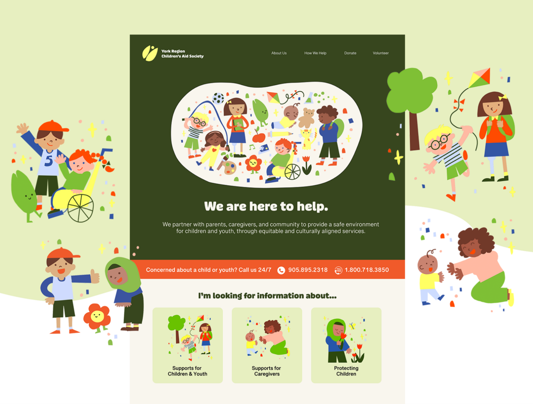
The final version of the redesigned website.
To learn more about the project, please visit the official RGD project page at this link.


